
UI Builder Component: Roadmap
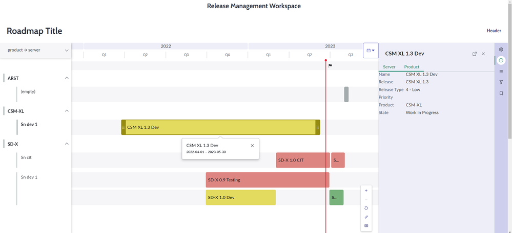
The Roadmap widget helps a lot to visualize all kind of planned tasks on a schedule.
It supports:
- Grouping the rows by max. 2 levels
- Coloring by data values (eg. status)
- View panel for details
- Milestones
- Data items direct on the bar
- Fexibel side panel
- Editing by drag and drop
- ... and more
Challenges:
- To know how JSON structures looks like
- It displays nothing if the configuration is wrong. (That may be frustrating)

In next section I describe step by step the configuration.
Step-by-step
Example of Roadmap items (as JSON):
[
    {
        "details": [    // collection of details to be displayed in details panel
            {
                "label": "Name",
                "value": {
                    "type": "string",
                    "value": "SD-X 0.9 Development"
                }
            },
            {
                "label": "Release",
                "value": {
                    "type": "string",
                    "value": "SDX 0.9"
                }
            },
            {
                "label": "Release Type",
                "value": {
                    "type": "string",
                    "value": "2 - High"
                }
            },
            {
                "label": "Priority",
                "value": {
                    "type": "string",
                    "value": "Major"
                }
            },
            {
                "label": "Product",
                "value": {
                    "type": "string",
                    "value": "SD-X"
                }
            }
        ],
        "id": {             // mandatory element!
            "displayValue": "RLSE0010010",
            "value": "RLSE0010010"
        },
        "planned_end": {               // to be mapped in meta data as end date
            "displayValue": "2022-06-13 12:45:09",
            "value": "2022-06-13 12:45:09"
        },
        "planned_start": {            // to be mapped in meta data as start date
            "displayValue": "2022-09-28 06:44:16",  // display values of start and end date must be in the internal format
            "value": "2022-09-28 06:44:16"
        },
        "product": {
            "displayValue": "SD-X",
            "value": "PDCT0010001"
        },
        "rel_phase": {
            "displayValue": "Development",
            "value": "development"
        },
        "release": {
            "displayValue": "SDX 0.9",
            "value": "RLSE0010007"
        },
        "server": {
            "displayValue": "Sn dev 1",
            "value": "9251029747d721102bb36241e36d43f9"
        },
        "short_description": {
            "displayValue": "SD-X 0.9 Development",
            "value": "SD-X 0.9 Development"
        }
    }
]
Additional data can included in an item. The id element and date elements for start and end are mandatory
It contains comments by //. Of course comments are not valid in JSON .
Next the roadmap items meta data example:
{
    "colorableFields": [
        {
            "label": "Release Phase",
            "name": "rel_phase"      // must match to an element in field color mappings!
        }
    ],
    "endDateField": {
        "label": "Planned end date",
        "name": "planned_end_date"
    },
    "groupableFields": [
        {
            "label": "Project manager",
            "name": "project_manager"
        },
        {
            "label": "State",
            "name": "state"
        },
        {
            "label": "priority",
            "name": "priority"
        }
    ],
    "itemNameField": {
        "label": "Project name",
        "name": "short_description"
    },
    "itemOwnerField": {
        "label": "Project manager",
        "name": "project_manager"
    },
    "startDateField": {
        "label": "Planned start date",
        "name": "planned_start_date"
    }
}
Coloring
Next an example of Field color mapping:
{
    "rel_phase": {
        "deployment": {
            "background": "rgb(201,224,202)",
            "border": "rgb(22,79,26)",
            "pillColor": "positive",
            "progress": "rgb(119,178,123)"
        },
        "development": {
            "background": "rgb(244,240,191)",
            "border": "rgb(149,139,17)",
            "pillColor": "warning",
            "progress": "rgb(227,218,96)"
        },
        "QA": {
            "background": "rgb(241,206,205)",
            "border": "rgb(120,36,32)",
            "pillColor": "critical",
            "progress": "rgb(221,133,129)"
        }
    }
}
Milestones
If you want to display milestones here an example how the structure of data must look like:
{
    "roadmapItemMilestones": [
        {
            "RLSE0010010": [           // the ID aof an Roadmap Item
                {
                    "dueDate": {
                        "displayValue": "01.04.2023",
                        "value": "2023-04-01"
                    },
                    "id": {
                        "displayValue": "97f8699547a361102bb36241e36d4398",
                        "value": "97f8699547a361102bb36241e36d4398"
                    },
                    "name": {
                        "displayValue": "Customer Ref Item Milestone",
                        "value": "Customer Ref Item Milestone"
                    },
                    "state": {
                        "displayValue": "Achieved",
                        "value": "achieved"
                    },
                    "type": {
                        "displayValue": "Launch Date",
                        "value": "launch_date"
                    }
                }
            ]
        }
    ],
    "roadmapMilestones": [
        {
            "dueDate": {
                "displayValue": "2023-07-01 09:00:00",
                "value": "2023-07-01 09:00:00"
            },
            "id": {
                "displayValue": "M1",
                "value": "M1"
            },
            "name": {
                "displayValue": "Milestone 1",
                "value": "Milestone1"
            },
            "state": {
                "displayValue": "upcoming",
                "value": "upcoming"
            },
            "type": {
                "displayValue": "key_event",
                "value": "key_event"
            }
        }
    ]
}
Example of Milestone meta data:
{
    "type": {
        "important_date": {        // must match to milestone type values
            "icon": "calendar-clock-fill"
        },
        "key_event": {
            "icon": "flag-fill"
        },
        "launch_date": {
            "icon": "rocket-fill"
        }
    }
}
Extend the component UI
The roadmap component can be extended by additional components.

Details display
specially to display details additional components must be configured. I have used the "Label Value Tabbed" component to display additional details when a road map item is selected. The data for details display can be included directly in the roadmap items data (see the example above).
To display the details the "roadmap item selected" event must be implemented

Sidebar
The sidebar can be extended with additional buttons(icons)
Here an example for 2 buttons:
[
    {
        "icon": "filter-outline",
        "order": 100,
        "name": "Filter"
    },
        {
        "icon": "bookmark-outline",
        "order": 200,
        "name": "Bookmark"
    }
]
To process the click on these buttons the "Roadmap sidebar button clicked" event must be implemented.
https://www.servicenow.com/community/next-experience-articles/the-roadmap-component/ta-p/2593317